So, you've mastered variables, huh? We have learned that variables can represent numbers. That's good and all, but now let's change our focus from saving data to visualizing it. To see data, we need a medium to plot it on. That medium is a cartesian grid. You may have seen cartesian grids before, but now let's take a look at what they actually are. You can think of a cartesian grid as a sort of map on which we can place data. If at this point you are thinking to yourself, "I've never in my life seen or even heard of a cartesian grid," think back really hard, they're everywhere! Maybe you've seen longitudes and latitudes when looking at a map. Well longitudes and latitudes are just data points that surveyors have put on a giant cartesian grid: the world!
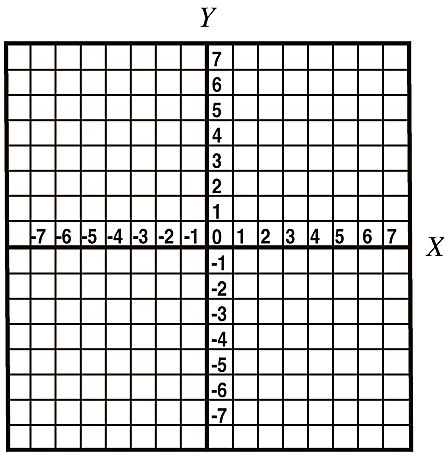
Now let's take a look at an example of a cartesian grid:
This grid can represent any numerical data points in two dimensions. The first dimension can be seen in the x-axis. The x-axis of a cartesian grid is the horizontal line (here labeled from -7 to 7) on which we can map the x-values of our data points. The second dimension can be seen in the y-axis. The y-axis of a cartesian grid is the vertical line (here labeled from -7 to 7) on which we can map the y-values of our data points. For now, let's not worry about the third dimenison.
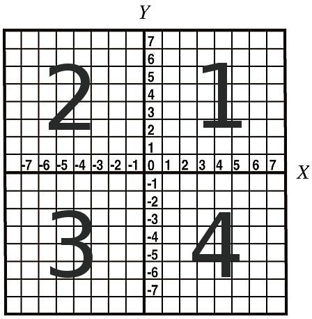
A 2-dimensional cartesian grid is separated by the x- and y-axis into four sections:
-
The first quadrant is the top right section of the cartesian grid and it encompasses all positive x- and positive y-values.
-
The second quadrant is the top left section of the cartesian grid and it encompasses all negative x- and positive y-values.
-
The third quadrant is the bottom left section of the cartesian grid and it encompasses all negative x- and negative y-values.
-
The fourth quadrant is the bottom right section of the cartesian grid and it encompasses all positive x- and negative y-values.
Here's a labelled version of the previous cartesian grid to better illustrate the four quadrants:
Now that we have a map, let's take a look at what we can place on the map, the data. To plot data points on our 2-dimensional cartesian grid, we will need x- and y-values. Let's try to plot the data point (6,8). The (6) in this data point is our x-value and the (8) is our y-value. For simplicity, here we will only look at positive values in the first quadrant, though the same principles can be applied to any quadrant of the graph.
Your turn! Type in an x- and y-value (each between 0 and 10) and click plot to see it on the graph.
So we've covered how to plot data on a graph, but what does this data mean? The only reason you would want to graph data is to later interpret it, so let's talk about at how to do that by looking at the following sample graph of people's ages and heights. I've added a few sample people.
A graph is only useful when given the graph, you can extract the required data. In this instance, looking at the graph above, we can see that we have data for four people. The graph's data can be represented in the following table:
| Age (years) |
Height (cm) |
| 14 |
120 |
| 19 |
146 |
| 20 |
160 |
| 23 |
140 |
Simple enough, right? However, theres one major problem with plotting data like this: plotting points one-at-a-time can a long time if you have a lot of data! To fix this, we can define equations which specify each data point (we will look more at this when we talk about polynomials later on). When we define these linear equations, we end up with a line. The following graph demonstrates the temperature conversion from Celcius to Fahrenheit.
Now let's see if you can interpret some data from our graph. Given a temperature value in degrees Celcius, see if you can find the corresponding Fahrenheit value (you don't have to be exact, just close).
Line graphs (like the one we just saw) can be thought of a special case scatter plots (where all the data points line up linearly and there infinitely many points following that trend). What do we do if we have a scatter plot that has data points that do not follow a straight-line pattern but we still want to represent them as a line? This is where we use a line-of-best-fit. For those of you who are interested, a line-of-best-fit can be calculated in many different ways. The simplest is the Least Square Method. To implement this method, you must find the average of the x- and y-values, respectively, then calculate a line that gives the smallest average standard deviation of the data points from the average x- and y-values. Rest assured, you don't need to know this method right now. For now we'll use an easier method, the Eyeballing Approach. Basically, to implement this approach, you look at your plotted data points, then try to draw a straight line that is as close as possible to all the data points. The closer you get, the more accurate your representation will be. Here's a demonstration of a line-of-best-fit for the scatter plot of heights and ages we looked at earlier.
As you can see, this line shows the general trend of the data (i.e. generally, as age increases, height tends to increase as well). This trend line is especially useful when trying to interpolate or extrapolate data.
-
Interpolation is the process of estimating new data points within the range of the given data points.
-
Extrapolation is the process of estimating new data points outside of the range of the given data points.
Interpolation and extrapolation are extremely useful when analyzing data and are extremely dependent on having an accurate line-of-best-fit. Let's say we want to estimate the height of someone who is 17 years old. We don't have a data point for that specific age, so we must look at our line-of-best-fit. As we can see, according to our line, a 17-year-old person will most likely have a height of around 130 centimeters. This is an example of interpolation as a 17-year-old person lies within our range of given data (ages 14 to 23). What if we want to estimate the height of a 10-year-old person? Well, once again, we don't have a specific data point for that age, so we must look at our line-of-best-fit. According to this line, a 10-year-old will likely have a height of around 115 centimeters. This is an example of extrapolation as a 10-year-old lies outside of our given age-range.
As you may have noticed, our line-of-best-fit may not be the most accurate as, if you extrapolate it further, it will tell you that a 50-year-old person will be 240 centimeters tall! Just to put that into perspective, the average height of an NBA player is 202 centimeters. This is a good demonstration of a misleading line-of-best-fit. To make the line more accurate, we would need to be supplied more initial data points.
-
The more data points on which we base our line-of-best-fit, the more accurate the line will be.
So now we've looked at how data relationships are represented on graphs and slightly touched upon interpreting that data. Later, we will dive deeper into this topic.